• Home
  • About
  • The Form
    • Template
    • Palette
    • Font / Typeface
    • Navigation
  • The Substance
    • Content
    • Functionality
    • Multimedia
  • Premier Services
  • Contact
Premier Breeder Websites

Font / Typeface

First, my apologies. I hope you understand how hard it is to make a page full of font choices look good :)

Three primary values when assigning website fonts: *

  1. Family - The name of the font. It is the "face" (hence typeface) of your message. For a breeder, it should instill trust, communicate professionalism and still be a reflection of who you are personally. How do you want your website visitors to "see" you?
  2. Size - It matters. We do not want your website visitors having to squint to read your page nor do we want it to look like a child's first learn-to-read, alphabet book either. Size changes according to the structural component (i.e. headline vs. paragraph text).
  3. Color - For Paragraph Text, we have learned "black" can be too hard on the eyes against a white/off-white background and so we use charcoals. Larger fonts, like Headings and Titles, can be coded to match your Palette if desired!

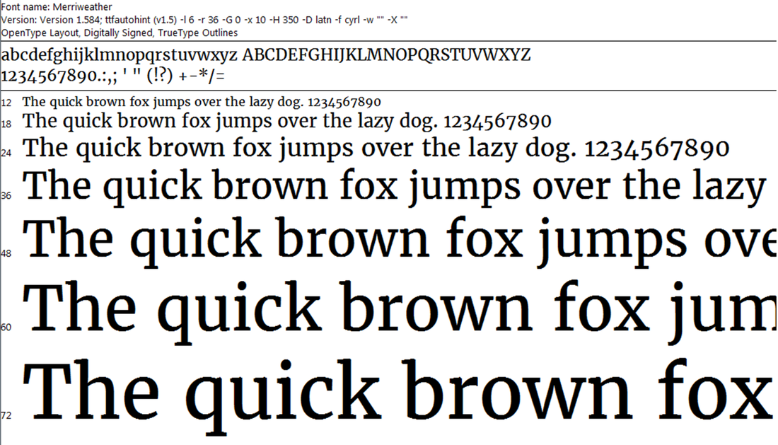
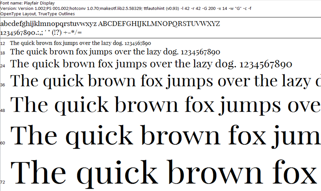
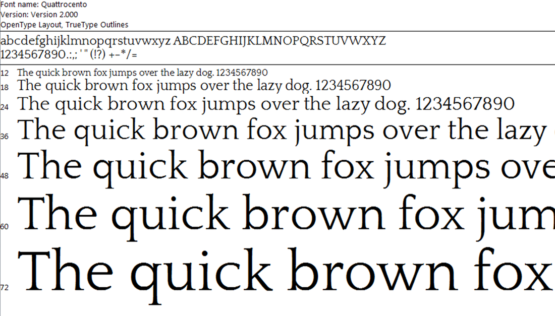
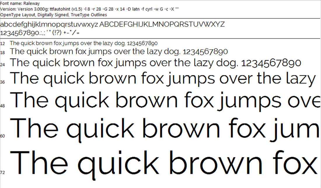
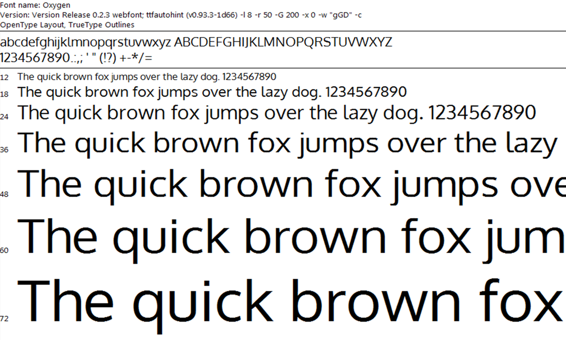
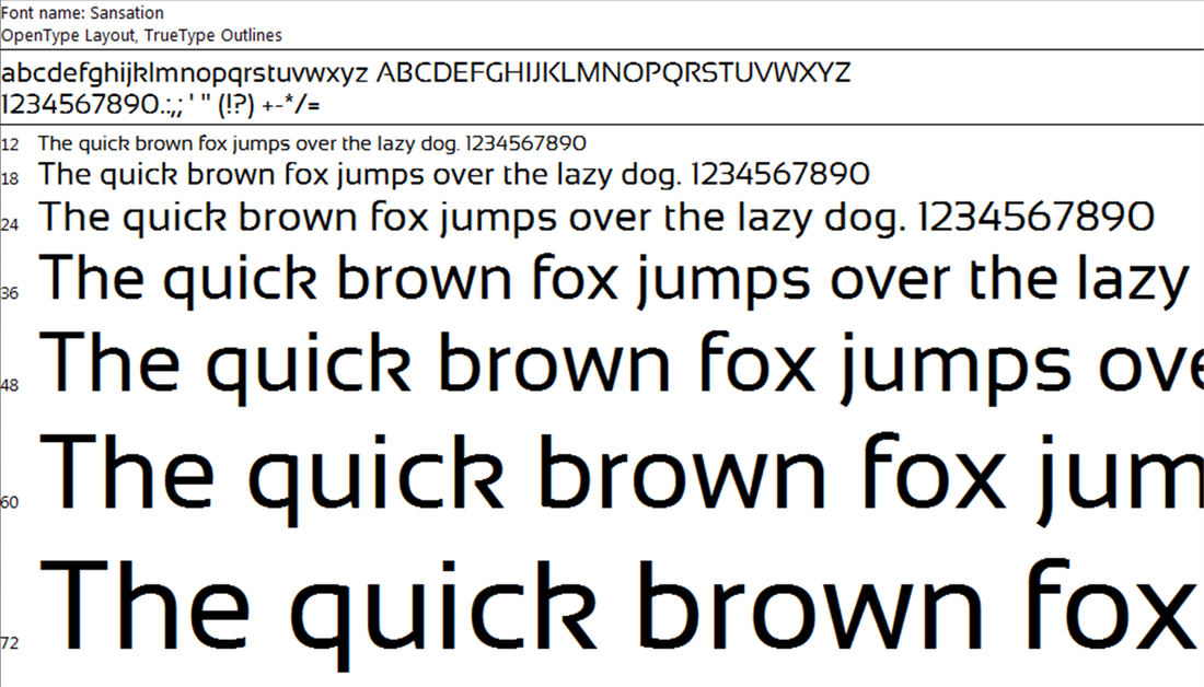
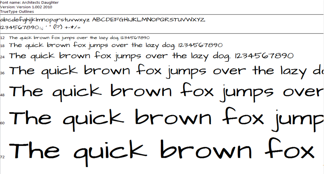
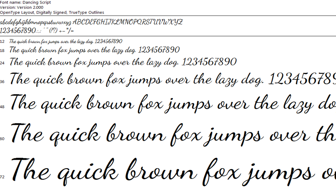
Gallery of Typefaces
Note: These are true type font (ttf) images captured from a system installer. The number on the far left is the size.
[ Click any image to begin Lightbox Slideshow ]

Merriweather is a text face that is pleasant to read on screens. As of now there are 4 styles: Regular, Light, Bold, and Black! This website uses Light for Navigation and Paragraph Titles.
Playfair Display is well suited for titling and headlines. It has an extra large height and shorter width. Artistic. Note rounded finishes.
Open Sans was designed with open forms and a neutral, yet friendly appearance. It is optimized for print, web, and mobile interfaces. This websites' Paragraph Text.
Quattrocento. Serif. A lighter weight font. Elegant and "softer" looking. Can be used for Titles or Text!
Raleway is an elegant sans-serif typeface family intended for headings and other large size usage.
Oxygen is a san-serif typeface. The main difference in this one is that it is tighter (letters closer together).
Sansation is a very artsy and stylized choice. It is strong and bold. Used for Headings and Paragraph Titles.
Inspired by the same, Architect's Daughter incorporates a graphic look combined with the natural feel of daily handwriting for a personal touch in Headings and Titles.
Dancing Script. Very "friendly" and personal appearance. Not for Navigation or Paragraph Text but can be used as a specialty font such as for Testimonials.
* Style (normal/italic), Weight (Normal/Bold) and using UPPERCASE vs. lowercase are discussed separately
but do make a difference in the look and feel of your website!
FUNCTIONALITY
  • Newsletter Form
  • Contact Form
  • Embed Code
  • Social Media Icons
  • Search Box
  • Downloadable Files
ADD-ON APPS
  • Call-Out-Box
  • FAQ's
  • Counter
  • Scroll To Top
  • Tabs Within Page
  • Section Animation
MULTIMEDIA
  • Gallery
  • Slideshow
  • Map
  • HD Video
  • Video Backgrounds
  • Audio Files
PREMIER SERVICES
  • eCommerce / Store
  • Custom Logos / Icons & Imagery
  • Social Networking
  • Mobile / Tablet Optimized
  • SEO and Analytics
Picture
Picture
© Premier Breeder Websites • All Rights Reserved • Webmaster
  • Home
  • About
  • The Form
    • Template
    • Palette
    • Font / Typeface
    • Navigation
  • The Substance
    • Content
    • Functionality
    • Multimedia
  • Premier Services
  • Contact